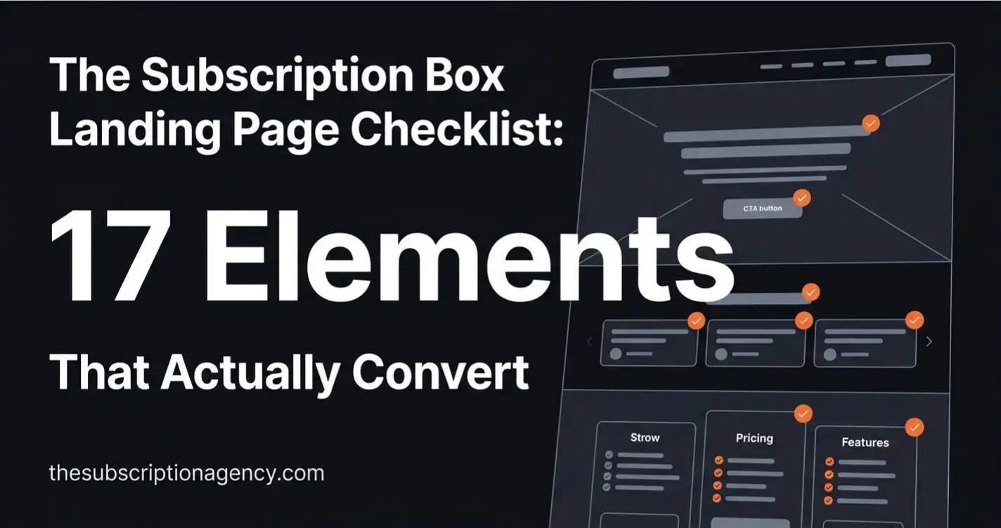
The Subscription Box Landing Page Checklist: 17 Elements That Actually Convert
Most subscription landing pages look good but don't convert. After building and auditing dozens of Subbly storefronts, here are the 17 elements that separate pages that sell from pages that just sit there.
Most subscription landing pages have the same problem: they were built to look good in a browser tab, not to convert a skeptical stranger at 11pm on their phone.
After building and auditing dozens of subscription storefronts on Subbly, the pattern is consistent. The pages that underperform aren't ugly — they're missing specific elements that do the actual selling. The pages that convert well aren't necessarily more beautiful — they're just more complete.
This checklist covers all 17. Work through it against your current page and treat every unchecked item as a conversion leak.
Key Takeaways
Most subscription landing pages fail at the hero section — the value proposition is vague, the CTA is weak, or the offer is buried below the fold.
Social proof is the single highest-leverage element on any subscription page. Quantity matters, but specificity matters more.
Friction in the checkout path — unclear pricing, missing guarantee, no plan comparison — kills conversions that the landing page already won.
Mobile is where most subscription purchases happen. If you've only optimized for desktop, you haven't optimized.
A landing page is never finished. The best-converting pages are the ones that get iterated on after launch, not the ones built perfectly once.
The Hero Section (Elements 1–5)
The hero is the only section every visitor sees. Everything else depends on whether this section earns the scroll.
1. A headline that states the outcome, not the product
The most common hero mistake: describing what the box contains instead of what it does for the subscriber.
Weak: "A monthly box of handpicked artisan coffee." Strong: "Discover a new specialty roast every month — curated by people who've tasted thousands."
The first tells them what it is. The second tells them what they get out of it. Visitors buy outcomes, not products. Your headline should answer "what does my life look like after I subscribe?" in one sentence.
2. A subheadline that handles the first objection
After reading your headline, a visitor's first thought is usually a version of "sounds good, but..." Your subheadline should pre-empt that objection.
Common first objections for subscription boxes: "Is this worth the price?", "Will I actually use everything?", "What if I don't like it?". Pick the one most relevant to your niche and answer it directly in the subheadline. Keep it one sentence.
3. A single, specific CTA above the fold
One CTA. Not "Subscribe Now" and "Learn More" and "View Plans" all competing for attention. One.
The label matters: "Get Your First Box" outperforms "Subscribe Now" because it's concrete and forward-looking. "Start Your Subscription" is better than "Sign Up." Test the label, but never test between having one CTA and having multiple — one always wins.
4. A hero image or video that shows the product being experienced
Not a flat product photo on a white background. Show the box being opened, the contents laid out, the reaction of someone receiving it. Subscription boxes are an experience product — the visual should convey the emotion of receiving, not just the object being sold.
If you have an unboxing video under 90 seconds, put it in the hero. Autoplay muted. It will outperform any static image.
5. Trust signals directly under the CTA
Immediately below your CTA button, add a one-line trust cluster: star rating, review count, cancellation policy, and delivery guarantee. Something like: "★★★★★ 4.9 from 340 subscribers · Cancel anytime · Ships within 3 days"
This line does the job of neutralizing the fear response that fires the moment someone sees a "Subscribe" button. Don't make them scroll to find this information.
Social Proof (Elements 6–8)
Social proof is the highest-leverage section on a subscription landing page. A visitor who was 40% convinced can become 80% convinced by the right review at the right moment.
6. Testimonials with specifics, not vague praise
"Love this box!" is not a testimonial — it's a decoration. Testimonials that convert contain a specific detail: a product name, a moment of surprise, a before/after.
Useless: "Amazing quality, highly recommend!" Useful: "I'd never heard of Yirgacheffe until my third box. Now it's the only thing I drink in the morning."
Collect testimonials with a post-box survey that asks: "What was your favourite item from this box and why?" That question gets specific answers.
7. Review count and rating prominently displayed
A visible aggregate rating (4.8★ from 280 reviews) near the top of the page reduces the cognitive effort of trust-building. Visitors don't read every testimonial — they scan the aggregate, then read one or two that catch their eye.
If you have reviews on a third-party platform (Google, Trustpilot, Facebook), display the count and star rating with a small platform badge. Third-party validation carries more weight than self-reported testimonials.
8. A "as seen in" or press bar if applicable
If your box has been featured in any publication, gift guide, or media outlet — even a niche blog — display the logo. A row of media logos, even from small publications, creates a legitimacy signal that subscriber testimonials can't replicate.
If you don't have press yet, skip this element rather than faking it. An empty or irrelevant press bar does more damage than no press bar.
The Offer (Elements 9–11)
Visitors who scroll past the hero are interested. The offer section is where they make the actual decision.
9. A clear pricing table with plan comparison
Never make a visitor hunt for the price. Pricing should be its own visible section with a clear comparison between plan options (monthly vs. quarterly vs. annual, single vs. gift, etc.).
The most effective format: three columns, each with a plan name, price per box, total billed, and a highlighted "most popular" tag on the plan you most want to sell. The comparison does the cognitive work for the visitor — they're choosing between your plans, not between you and a competitor.
10. A first-box offer or introductory discount
A visitor's biggest barrier to subscribing is uncertainty: "What if I don't like it?" A discounted or risk-reduced first box lowers that barrier directly.
This doesn't need to be deep. "First box 20% off" is enough to tip the hesitant visitor. More effective than a discount: a guarantee framing — "If your first box doesn't exceed your expectations, we'll refund it, no questions." The guarantee converts better because it addresses the fear rather than just reducing the cost.
11. What's in the box — with visuals
Show specific past box contents with photos and value totals. "January box: 6 items, $87 retail value" with images of each item does three things: demonstrates curation quality, justifies the price, and makes the abstract product concrete.
Avoid vague descriptions like "curated items you'll love." Show the actual items. If you're worried about spoiling the surprise, show a previous box rather than the upcoming one.
Friction Removal (Elements 12–14)
At this point in the page, a visitor has seen your hero, read your social proof, and looked at your pricing. The remaining friction is psychological — they're not unconvinced, they're hesitating. These elements clear the hesitation.
12. A cancellation policy that's impossible to miss
"Cancel anytime" needs to be visible in at least three places on the page: under the hero CTA, in the pricing table, and in the FAQ. Subscription fatigue is real — visitors are wary of being locked in. Proactively stating your cancellation policy removes this objection before it forms.
If your cancellation process is genuinely easy (self-serve through the customer portal, no email required), say that specifically: "Cancel in one click from your account — no email, no phone call needed." That level of specificity builds more trust than "cancel anytime."
13. An FAQ section that addresses real objections
The FAQ is not a formality. It's a closing tool. Every question in your FAQ should correspond to a real objection that stops people from subscribing.
The questions that matter most: When does my box ship? What if I'm not home? Can I skip a month? How do I cancel? Do you ship internationally? What if I don't like something?
Answer each one directly and completely. A vague FAQ answer ("shipping times vary") is worse than no answer because it signals evasiveness.
14. A money-back or satisfaction guarantee
A visible guarantee — even a 30-day satisfaction guarantee on the first box — removes the final purchase risk. It works because it shifts the frame from "I hope this is good" to "I can try this risk-free."
Format: a small badge or callout box with the guarantee terms, placed near the pricing CTA. Keep it short: "Not satisfied with your first box? We'll refund it in full, no questions asked."
Mobile and Technical (Elements 15–17)
These elements are invisible when done right and catastrophic when missed.
15. Mobile-optimized layout with thumb-friendly CTAs
More than half of subscription box purchases happen on mobile. If your page was designed on a desktop and "made responsive" as an afterthought, it's losing conversions on every device smaller than a MacBook.
The non-negotiables for mobile: CTA buttons at least 48px tall, no horizontal scrolling, hero text readable without zooming, and pricing table that stacks vertically rather than squishing horizontally. Test your page on an actual phone, not just a browser resize.
16. Page load speed under 3 seconds
Every additional second of load time reduces conversions. Large hero images, unoptimized video embeds, and too many third-party scripts are the most common culprits on subscription landing pages.
Run your page through Google PageSpeed Insights and treat anything below 70 on mobile as a conversion problem, not just a technical one. Compress images to WebP, lazy-load anything below the fold, and defer non-critical scripts.
17. Checkout flow continuity — no jarring transitions
The moment between clicking "Subscribe" and completing the checkout is where a significant percentage of conversions are lost — not because of price, but because of friction in the transition.
The checkout page should feel like part of the same site: same fonts, same colours, same tone of voice. If your landing page is warm and brand-heavy and your checkout looks like a generic payment form, the discontinuity creates doubt. On Subbly, the checkout is part of the same storefront — use it consistently with your brand rather than leaving it at default settings.
How to Use This Checklist
Go through your current landing page with this list open. For every unchecked item, add it to a prioritised backlog rather than trying to fix everything at once.
Start with elements 1–5 (hero), then 6–8 (social proof), then 12–14 (friction removal). These three groups have the highest individual impact. Elements 9–11 and 15–17 matter, but they convert visitors who were already close — the first three groups determine whether visitors get that far.
If you'd like a professional audit of your subscription landing page — with specific recommendations for your store — book a free strategy call. We'll walk through your page live and tell you exactly what's costing you subscribers.
The Subscription Agency designs and builds subscription storefronts on Subbly. Every build starts with a conversion audit. Book a free call to get started.